Journey Friction Analysis: Boost Conversions Across All Funnel Stages


Most funnels don’t fail all at once. They slow down.
A buyer clicks, then hesitates. Starts a form, then abandons it. Books a demo, then waits. Signs up for a trial, then never reaches the first useful moment.
Standard reporting tells you where the number dropped. Journey Friction Analysis shows you what made the movement break.
It looks beyond conversion rates to measure the effort, uncertainty, delay, and handoff failure that slow qualified users down.
Instead of asking only “What percent converted?”, it asks the more useful question: “Where did good prospects pause, repeat work, reroute, or give up?”
That’s the difference between reacting to a weak metric and fixing the step that caused it. This article shows you how to find friction across marketing, UX, sales, and RevOps, so you can stop buying more traffic to cover problems your funnel is already showing you.
What journey friction analysis measures across the funnel
Journey Friction Analysis measures the obstacles that interfere with forward movement from one stage to the next. In practice, it tracks effort, delay, uncertainty, repetition, abandonment, and handoff quality across the buyer journey.
Friction is broader than interface design. A user can hit friction because a page is hard to use, but also because the messaging attracted the wrong audience, the qualification criteria are unclear, the pricing is ambiguous, legal review drags, or a lead routing rule left their request untouched for hours. The user feels all of those the same way: as drag on progress.
That's why friction is best measured as a cross-functional issue:
- Marketing friction is weak intent match, offer confusion, poor audience targeting, or inconsistent messaging between campaign and page.
- UX friction is unnecessary clicks, high cognitive load, unclear navigation, form burden, and error-prone flows.
- Sales friction is response delays, poor routing, repeated qualification, scheduling lag, and unclear next steps.
- Commercial friction is pricing ambiguity, approval hurdles, contract complexity, and onboarding delays.
Measure movement quality, not just final conversion
Traditional conversion metrics focus on whether a stage eventually produced the desired result. Friction metrics focus on how efficiently and confidently users moved. Two landing pages can post the same conversion rate, but one may require multiple return visits, longer completion time, and heavier assisted follow-up. It looks equal in top-line reporting while quietly costing more pipeline effort and creating more downstream leakage.
So the core question changes from final outcome to movement quality:
- How much effort was required?
- Where did users pause?
- What signals showed uncertainty?
- Which step caused abandonment?
- Where did a handoff slow or break?
This is most useful when the funnel isn't visibly broken, yet growth is weaker than traffic, demand, or sales capacity suggest it should be.

Why standard conversion reporting fails to explain funnel drop-off
The numbers arrive too late
Standard funnel reporting runs on lagging indicators. Conversion rate, bounce rate, MQL count, SQL volume, pipeline created, and closed-won revenue all tell you what happened after users had already passed through a series of decisions and obstacles. By the time those numbers fall, the underlying friction has usually been there for weeks.
Averages hide the bottleneck
Aggregate reporting smooths over stage-specific bottlenecks. A campaign can post strong click-through rates that suggest healthy top-of-funnel performance, while the landing page fails to match the ad's promise. Demo requests can rise while booked meetings lag because scheduling takes too long. Trial signups can look healthy while activation suffers because users can't finish setup without help.
Those failures are easy to miss when reporting collapses several stages into one average. Averages hide flow shape. They tell you the journey produced less value, but not where movement weakened.
Not every exit is a problem
Conventional reporting also tends to treat all drop-offs as equal. They aren’t. Some exits are productive filtering. If an unqualified visitor leaves after realizing the product isn't a fit, that's not necessarily a funnel problem; in fact, it may save sales capacity.
Other exits are repairable friction, like a high-intent buyer abandoning a form because the required fields are excessive, or because the pricing model is unclear.
Without that distinction, teams make predictable mistakes:
- Adding traffic to compensate for conversions lost to a broken step
- Sending more leads to sales when response speed is already the bottleneck
- Redesigning pages that filter fine but receive weak lead quality upstream
- Blaming "market conditions" for what is actually a process delay
Standard conversion reporting is good for monitoring outcomes and weak at diagnosing cause. Journey Friction Analysis fills that gap by isolating where progression quality deteriorates before the headline KPI drops.
Funnel Friction Audit Toolkit: Prioritize Fixes in 30 Minutes
Enter your email address to get a comprehensive, step-by-step guide

An operational framework for diagnosing friction by stage, flow, and handoff
Peep Laja, founder of CXL, argues that proper conversion research should show “where are the problems, what the problems are and why those problems are problems to begin with.” Journey Friction Analysis applies that same logic to the funnel: find where qualified movement is slowing, identify the friction behind it, and give the right team a clear problem to fix.
Map the journey first
Start with the actual journey, not the reporting dashboard. Map one path from first meaningful touch to the outcome you care about. For each stage, define the expected user action, the effort it takes to complete, and the next step that should logically follow.
Example-in-action:
A simple stage map might read: ad click, landing page review, form start, form submit, meeting booked, meeting attended, opportunity created.
Another path: product page visit, trial signup, activation milestone, paid conversion, expansion event.
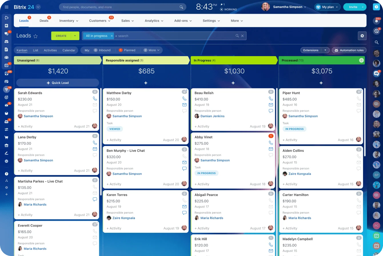
The exact stages matter less than having a clear model of expected movement. Most teams already hold this movement data inside a CRM, so the map is usually a matter of organizing what's already being captured rather than instrumenting from zero.
Separate within-stage friction from handoff friction
Then split friction into two types:
- Within-stage friction is when users struggle inside a step, like rereading pricing content several times, hitting form errors, or spending too long on setup.
- Between-stage handoff friction is when users finish one step but don't progress cleanly to the next, like submitting a demo request and then waiting too long for a rep to respond.
This split is operationally useful because the owners are usually different. A page-level issue belongs to marketing or UX. A response delay belongs to sales operations. Combine them and the fixes get vague and accountability disappears.
Measure four movement behaviors
For each stage and handoff, watch four behaviors:
- Users pause when the time to their next action runs longer than expected.
- Users repeat when they revisit, reload, or restart before progressing.
- Users abandon when they exit before completing the expected action.
- Users reroute when they seek another path, jumping to support, pricing, or sales chat instead of continuing.
Pair leading and lagging signals
Build both leading and lagging signals into the framework. Leading indicators forecast where conversion loss will appear: step completion speed, revisit patterns, sales response delay, activation latency. Lagging indicators confirm the downstream effect: lower SQL creation, weaker opportunity progression, reduced expansion revenue.
Used together, they show cause and effect. If time to first sales response worsens this week and SQL-to-opportunity conversion weakens next week, the handoff issue is no longer anecdotal. It's measurable pipeline friction, and someone owns it.
The metrics that matter most in journey friction analysis
Not every funnel metric is equally useful here. The best ones expose where progression slows, where effort spikes, and where qualified users fall out before value is captured.
A RevOps analyst or growth lead usually pulls these into a weekly funnel review, watching the leading indicators closely and checking them against the lagging ones over a longer window.
|
Metric |
What it reveals |
Indicator type |
|---|---|---|
|
Stage-to-stage conversion rate |
Where movement weakens between major journey steps |
Lagging |
|
Abandonment rate by step |
Which exact page, form, or action loses users |
Leading |
|
Form completion rate |
Whether required effort is suppressing response |
Leading |
|
Time-in-stage |
Where buyers are hesitating or waiting |
Leading |
|
Repeat visit rate |
Where unresolved questions force users to come back |
Leading |
|
Sales-response SLA adherence |
Whether handoff execution supports progression |
Leading |
|
Closed-won rate |
Final downstream commercial effect |
Lagging |
Stage conversion is only a starting point
Stage-to-stage conversion rate is still useful, but only as a starting point. It tells you where to investigate, not what to fix. If visit-to-demo conversion drops, the next question is whether the issue sits in audience quality, content relevance, form effort, or delayed follow-up.
Abandonment and time-in-stage get closer to why
Abandonment rate by step is often more actionable.
If users start a form but exit disproportionately at one field cluster, the problem is probably burden or trust, not overall demand. A B2B signup that asks for company size, job title, and phone number before the trial even starts will often shed exactly the high-intent users it most wants to keep. If users abandon after the pricing page, pricing clarity is the likely blocker.
Time-in-stage is the metric teams most often overlook. Extra time can signal serious intent, but when it rises alongside repeat visits, support usage, or delayed action, it usually points to unresolved uncertainty.
A pricing page with unusually high revisit frequency tends to mean prospects are trying to answer a buying question the page doesn't address, and they keep coming back to look for it.
A slow handoff wastes a fast funnel
Sales-response SLA adherence matters because a fast top-of-funnel can be wasted by a slow commercial handoff. The classic Harvard Business Review study of more than 2,000 U.S. companies found that firms contacting a lead within an hour were nearly seven times as likely to qualify it as those that waited an hour longer, yet the average response time was 42 hours.
A team that routes every web demo request into a shared inbox, with no owner and no SLA, will usually land somewhere near that average without realizing it. Lead volume looks healthy while qualified progression quietly drops.
Closed-won confirms too late to act
Field-level drop-off, response delay, and activation completion are strong early warnings. Closed-won rate matters, but it moves too late to diagnose active friction. By the time close rates move, the problem has already worked all the way through the pipeline.
How marketing, UX, and sales teams turn friction metrics into decisions
These metrics earn their value when teams read them through their own operating lens.
Marketing
Marketing should use friction metrics to challenge false demand assumptions. If traffic grows but stage progression weakens, the answer isn't always more volume. It might be a message mismatch between ad promise and landing page, a nurture sequence that never answers evaluation questions, or a campaign hitting segments that click but don't progress.
Friction data helps marketing reallocate spend, tighten positioning, and fix offer continuity.
UX
UX teams read these metrics through effort and task flow. Repeated clicks, high error rates, long completion times, and restart behavior point to interaction problems that slow the flow.
The best UX calls come from linking those signals to business movement. Removing three nonessential fields from a form is only a win if qualified submissions go up without lead quality going down, which is the part teams often forget to check.
Sales and RevOps
Sales and RevOps need friction visibility at the handoff layer. A lead can complete the marketing action and still stall because routing logic is weak, ownership is unclear, or response timing is inconsistent.
Metrics like speed-to-lead, booking lag, post-handoff no-show rate, and qualification-to-opportunity progression help these teams fix execution where marketing data alone can't explain the leak.
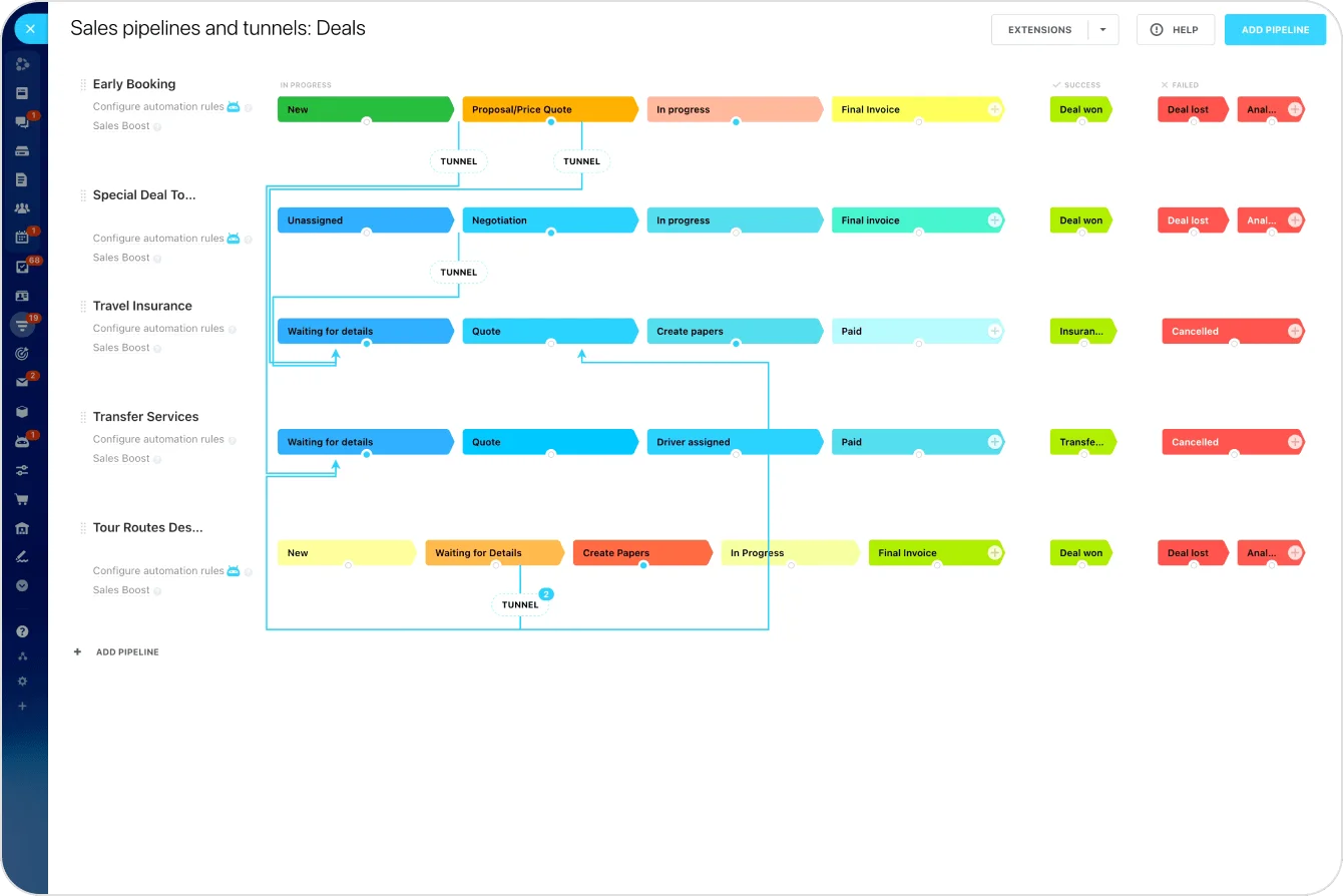
Most of that fix lives in execution discipline rather than more volume. Automated lead routing assigns every inbound request to an owner the moment it lands, and a follow-up task can fire automatically when first contact slips past the target window.
Shared friction analysis also improves forecast confidence. When teams know whether underperformance comes from acquisition quality, page-level effort, or sales handoff delay, they can model recovery far more realistically than by staring at an aggregate conversion percentage.
Common journey friction measurement mistakes that distort funnel decisions
Measuring only the endpoints
A common mistake is measuring only final conversion events. When teams track demo requests or purchases without also tracking form starts, page exits, revisit behavior, and response timing, they lose the causal story. They can see the endpoint changed, but not where the journey started to fail.
Blending unlike audiences into one average
Another frequent error is blending unlike audiences into one friction average. Branded search, cold paid social, partner referrals, and returning prospects all behave differently, and so do SMB and enterprise buyers. Roll them into one funnel view and you may miss that one audience converts cleanly while another hits a specific barrier.
Averaged friction is often misleading friction.
Overreacting to every drop-off
Teams also overreact to any visible drop-off. Not every exit deserves intervention. Good funnels filter out weak-fit users before the expensive downstream steps. Used without qualification logic, friction analysis can push teams to strip away useful guardrails and flood the pipeline with low-quality volume, which makes top-of-funnel numbers look better for a while and creates more work for everyone behind them.
The same caution applies to forms.
Cutting fields is the reflexive fix, but experiments compiled by CXL show that reducing field count sometimes lowers conversions, because length isn't the only source of friction. A confusing label, a low-trust ask, or weak copy near the form can matter more than the number of inputs.
Other distortions come from sloppy interpretation:
- Assuming long time-in-stage always means high intent rather than unresolved uncertainty
- Treating revisit behavior as engagement without checking whether users are failing to find answers
- Blaming UX for problems caused by audience targeting or sales response lag
- Using one path baseline when users actually move through several routes
Useful friction does real work, filtering weak-fit users and surfacing readiness signals that protect downstream capacity. The job is to clear the friction that blocks qualified progress while leaving that protective filtering in place.

How to implement friction reporting without building a dashboard monster
You don’t need a giant dashboard to start finding funnel friction. You need a narrow path, a small metric set, enough context to explain the numbers, and clear ownership for what happens next.
Start with a lean reporting model
- Pick one high-value funnel path: Choose a journey tied to a real goal, such as paid traffic to demo request, trial signup to activation, or opportunity creation to proposal acceptance.
- Identify the key handoffs: Look for the points where users move between systems, teams, or decisions. These are usually where delay and ownership problems appear.
- Keep the first version shippable: A focused model can be useful in days. A perfect model that tries to cover every path usually takes quarters and still ends up too noisy to use.
Track only the metrics that explain movement
For most teams, five to seven measures are plenty at first:
- Stage conversion
- Step abandonment
- Time-in-stage
- Repeat visit rate
- Handoff delay
- Next-step completion
- One downstream outcome metric
If every team adds every available data point, the report turns noisy and loses diagnostic value.
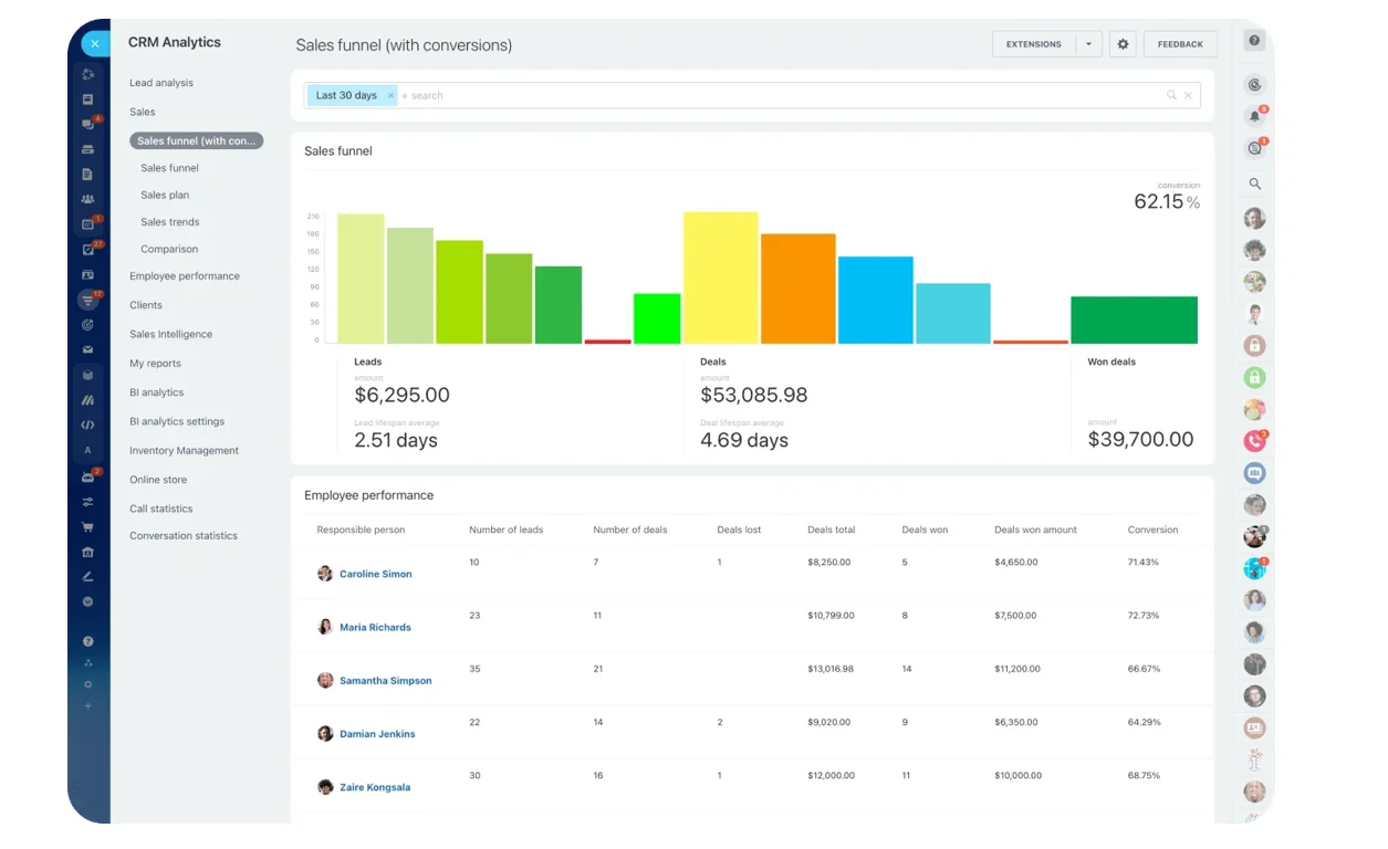
Pulling the metrics from the same place the pipeline already lives, through CRM analytics and reporting, keeps the numbers consistent and avoids a separate spreadsheet nobody trusts by month two.
Pair the numbers with real evidence
Quantitative signals should be checked against qualitative evidence before teams prioritize changes:
- Session reviews show where users hesitate.
- Sales call notes surface objections the site never addressed.
- Support themes reveal onboarding confusion.
- Short on-page surveys confirm whether pricing, trust, or next-step clarity is the real issue.
Numbers show the pattern. Qualitative evidence confirms the source.
Prioritize the fixes that free up qualified movement
Rank fixes against four factors:
- Revenue impact: how much value the affected path influences
- Stage volume: how many users hit the issue
- Implementation effort: how hard the fix is to ship
- Downstream effect: whether a fix here amplifies later stages
This keeps teams from chasing the loudest stakeholder or the easiest cosmetic tweak. A small improvement early in a high-volume path can beat a larger improvement at a low-volume late stage.
Assign clear owners
The model works best when metric owners are explicit. Marketing owns campaign-to-page continuity. UX owns task-completion barriers. Sales and RevOps own routing and response execution, often supported by automation rules that escalate a lead when a response SLA is missed.
Shared visibility matters, but accountability still needs to be local. Otherwise every weak number becomes someone else’s problem.
FAQs
What's the difference between friction and normal funnel filtering?
Filtering removes poor-fit users before they consume more resources. Friction blocks qualified users who should be progressing. You can see the difference when high-intent or good-fit prospects pause, abandon, repeat work, or need unnecessary assistance.
Which funnel stages should be measured first?
Start with the path closest to revenue, or a stage where volume is high and progression has weakened. For many teams that's ad-to-landing-page-to-form, demo request to first sales contact, or trial signup to activation.
How often should friction metrics be reviewed?
Leading indicators like abandonment, response delay, and time-in-stage should be reviewed weekly, or even daily in high-volume funnels. Lagging outcomes like SQL progression or closed-won impact are better reviewed on a longer cycle, because they take time to mature.
What does Journey Friction Analysis improve?
It raises the quality of conversion rather than the raw total. Teams get more qualified movement, less wasted effort, shorter delays, cleaner handoffs, and more reliable forecasts.
Turn funnel friction into clear fixes
Bitrix24 unites CRM, forms, routing, automation, tasks, and reports so teams spot delays, assign fixes, and move leads faster.
Get Started NowTurn hidden friction into owned action
Funnel improvement gets easier when teams stop debating the average and start fixing the specific step. The offer that confuses. The form that asks too much. The handoff that sits too long. The activation path that loses momentum after signup.
That’s the practical value of Journey Friction Analysis. It turns vague underperformance into work someone can own, prioritize, and remove without guessing at the whole funnel.
Bitrix24 brings the pieces of that response into one workspace: CRM records, forms, lead routing, automation, tasks, contact center tools, and reporting.
Sign up for free today and start turning hidden funnel friction into clear, assigned fixes your team can act on.