Burnup Chart App

1 min read
Vlad Kovalskiy
June 14, 2021
Last updated: April 5, 2023
Burnup Chart App
If you're involved in project management and need to overview project deadlines based on the number of tasks required to complete, Burnup Chart app might be a perfect match. It works in real-time and let's you visualize the estimated time needed to finish a project.

11.png


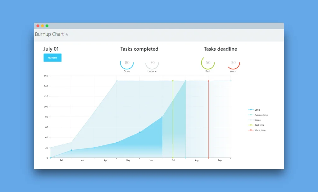
There are two types of data that the graph builds upon:

  1. Y-axis: the number of tasks within the project
  2. X-axis: project timeline

  The graph has five coloured lines and areas:
  • Done – shows you a trend of completed tasks over a timeline
  • Average time – a rough time estimate for completing all of the project’s tasks
  • Scope – total number of tasks
  • Best time – the estimated soonest date of completing a project
  • Worst time – the time you are not expecting to exceed for project completion
Now, at any moment, you can view estimated time when a project will be completed. Watch a quick app overview here.

Most Popular
Crafting Effective Prompts For Bitrix24 CoPilot
Bitrix24's Seamless Drive Integration and Collaborative Editing Explained
The Latest Bitrix24 Desktop App Update Is Here
Advance Your Business With The Ultimate Bitrix24 Webinar Series
Beyond the Click: How Bitrix24 and Google Docs Integration Enhances Team Collaboration
You may also like
articles
webinars
glossary

Free. Unlimited. Online.

Bitrix24 is a place where everyone can communicate, collaborate on tasks and projects, manage clients and do much more.

Start for free
You may also like
Product Properties In Deals
Bitrix24 tips and updates
Product Properties In Deals
1 min read
Bitrix24 Plans: Which One To Choose
Bitrix24 tips and updates
Bitrix24 Plans: Which One To Choose
3 min read