The First 30 Minutes of a Software Trial: What Confuses Real Users First


The first 30 minutes of a software trial often decide whether evaluation continues or quietly dies.
If users get confused early, the damage goes beyond product engagement. Sales loses cleaner qualification signals. Growth teams misread intent. Product teams get noisy onboarding data. And good-fit buyers may leave before they’ve seen enough value to make a fair judgment.
The useful question isn’t whether users “engaged” with the trial; it’s whether the product gave them a fair chance to prove its value.
Here’s how to find the moments where that evaluation breaks down.
What “first-30-minute user confusion” means in a software trial
First-30-minute user confusion is the gap between what a new user expects to accomplish quickly and what the product makes clear or possible in the opening session.
The issue is deeper than a slow setup flow. It’s a mismatch between the user’s goal and the product’s first path.
Confusion vs. friction vs. bugs
General onboarding friction might mean too many clicks or an annoying setup flow. Technical bugs mean something is broken. Confusion is different: the user can’t answer basic questions like:
- “What should I do first?”
- “How do I get to the result I came for?”
- “Is this the right workflow for my problem?”
- “Am I setting this up correctly?”
That’s why phrases like “what confuses users during a software trial” and “why new trial users fail to reach value fast” point to a business problem rooted in comprehension, not interface polish alone.
What users bring into the first session
New trial users usually arrive with a job in mind: build a dashboard, import a team, connect a workflow, assign a project, analyze a risk, or test an API.
If the product language, screen structure, or setup sequence doesn’t support that expected path, the user starts guessing. Guessing is the beginning of drop-off.
Early confusion often appears as:
- Hesitation
- Repeated clicks
- Backtracking
- Skipped setup
- Premature help-doc use
- Abandonment after a shallow scan
These are signs that the product is failing to translate intent into action.
Pro Tip: Don’t define activation as “completed signup.” Define it as the first meaningful proof point. For a CRM, that might be creating a deal and seeing it in a pipeline. For project management software, it might be creating a task, assigning an owner, and seeing the work appear in a shared view.

Why early trial confusion matters for adoption and buying decisions
Users rarely isolate confusion to the trial experience. They treat it as evidence about the product.
If value isn’t obvious in the first session, buyers may assume implementation will be slow, training will be heavy, and adoption will be painful.
The trial is part of the sales motion
First-session clarity influences whether a user reaches activation, invites others, requests a demo, or becomes a product-qualified lead. In a self-serve model, the trial is part of the sales motion.
A user who understands the core value quickly is more likely to share the product internally with a specific recommendation: “This could replace our spreadsheet-based pipeline review.”
A confused user may still mention it, but usually in vague terms: “I tried it, not sure yet.” Those two reactions create very different buying momentum.
Where revenue signals get weaker
Sales teams feel this directly. When trial users arrive confused, reps spend time explaining what the product does, why the workflow works that way, and what the customer should have accomplished already.
The conversation shifts from evaluation to orientation.
On one evaluation, the sales lead arrived at the follow-up call with three browser tabs open, an empty pipeline, and a spreadsheet containing the deals they had tried to import. The rep spent most of the call repairing field mappings and explaining pipeline stages. The account was still logged as an inactive trial, even though the buyer had spent several hours trying to make the product work.
A poor first session can weaken several revenue signals:
- Activation rate: Users don’t complete the actions tied to initial value.
- Product-qualified leads: Strong accounts may never show the behaviors used to flag intent.
- Demo requests: Users ask for help earlier, but from a weaker evaluation position.
- Paid conversion: The product feels harder to adopt than it may actually be.
- Sales efficiency: Reps spend more time correcting confusion than advancing fit.
A Wyzowl onboarding survey found that over 90% of customers felt companies could do better when onboarding new users. That doesn’t mean every product needs a longer tutorial. It means the first experience has to answer the user’s practical question: “Can I get somewhere useful without fighting the tool?”
15-Minute Trial Onboarding Audit Checklist and Scorecard
Enter your email address to get a comprehensive, step-by-step guide

How confusion emerges in the first 30 minutes of product evaluation
Most trial sessions follow a predictable pattern. A user creates an account, completes some setup, scans the navigation, attempts a first task, and looks for proof that the product can solve the problem they came to test.
Confusion appears when one of those moments breaks expectation.
Common breakpoints in the first session
The issue may start with a signup flow that asks for too much before the user understands why. It may appear on a dashboard full of labels but no clear next move.
Or the first task may depend on something the user doesn’t have yet, such as:
- Admin access
- Sample data
- An integration
- A teammate
- A configured workflow
- Permission from another department
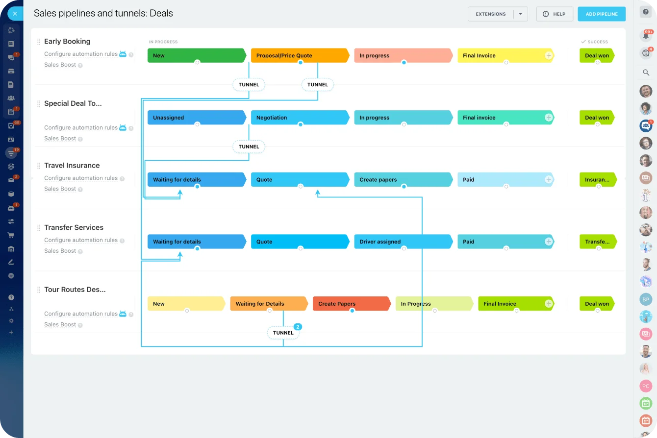
A sales manager testing a CRM, for example, may want to see how deals move through a pipeline. If the trial starts with empty records, undefined stages, and no sample view, they can’t judge pipeline visibility. They’re forced to build the evaluation environment before they can evaluate the product.
How evaluators interpret confusion
Common causes include terminology mismatch, too many choices, unclear next actions, empty-state ambiguity, and hidden dependencies.
Evaluators interpret these moments as product truths. They’re deciding whether the software seems intuitive, mature, and ready for real use.
|
User goal |
What the product presents |
How confusion is interpreted by the evaluator |
|
Build dashboards |
Blank analytics workspace with multiple setup options |
“This will take too much configuration before I see anything useful.” |
|
Start collaboration |
Complex workspace settings before visible activity |
“Team rollout looks heavier than expected.” |
|
Automate a workflow |
Integration prompts before examples |
“We may need technical support just to test this.” |
|
Evaluate security posture |
Policy menus without contextual guidance |
“This is specialized and hard to operationalize.” |
|
Test a CRM |
Empty pipeline with no sample records or next action |
“Reporting and adoption will take more work than expected.” |
For products that combine multiple workflows, the first session needs a clear path by use case. In Bitrix24, for example, a new user testing CRM shouldn’t have to understand every workspace feature before they can create a deal, view a pipeline, or assign a follow-up task.
Core sources of friction in early trial experiences
The first session is shaped by signup flow, workspace setup, navigation, default data states, guidance patterns, and permissions. Together, they determine whether the user sees a path to value or a wall of prerequisites.
Interface friction
Interface friction is about interaction: too many clicks, poor navigation cues, weak hierarchy, unclear buttons, or menus that use internal product language instead of user language.
This kind of friction slows users down. It doesn’t always kill evaluation on its own, but it adds doubt. A buyer who has to search for the next step will often assume their team will need hand-holding too.
Conceptual friction
Conceptual friction is about understanding. The user doesn’t grasp what an object, workflow, or screen means.
This is common in products with custom terms. A product team may know exactly what “workspace,” “object,” “rule,” “flow,” or “segment” means. A new evaluator may not.
If the first screen depends on those terms, the user spends the first session decoding the system instead of testing the use case.
Organizational friction
Organizational friction comes from dependencies outside the interface, such as teammates, integrations, approvals, admin permissions, or clean customer data.
This can block evaluation entirely. A project management trial, for example, may not feel useful until a teammate is added. An automation trial may need an integration before anything runs. A CRM trial may need imported contacts before pipeline visibility makes sense.
A practical framework for diagnosing friction
A simple framework can keep analysis grounded:
- Expected outcome: What result does the user think they should reach quickly?
- Required effort: How much setup, navigation, or input is needed before progress is visible?
- Visible feedback: Does the product show that the user is moving toward a useful result?
- Time-to-first-meaningful-result: How long does it take before the evaluator can say, “Yes, this works for our use case”?
This avoids a common trap: optimizing isolated screens instead of evaluating whether the opening experience supports a believable result.
Pro Tip: Review the first session by role, not only by funnel step. An admin, sales rep, department manager, and executive sponsor won’t judge the same screen in the same way. The same trial path can feel clear to one persona and irrelevant to another.

Common mistakes companies make when interpreting trial confusion
Teams often misread early confusion because they look at the wrong signal. They see low usage and assume weak intent. They see support tickets and assume edge cases. They see a quiet trial account and assume the user wasn’t serious.
The harder question is whether the product gave that user a fair first path.
Mistake 1: Assuming users need more training
One common mistake is assuming confused users simply need more training. If new users can’t understand how to evaluate the product in the opening session, adding more educational material may just create more content around the same unclear path.
Training helps when users are learning advanced workflows. It doesn’t fix a first session where the user doesn’t know what to do next.
Mistake 2: Believing serious buyers will push through
Another weak assumption is that serious buyers will push through. Some will. But many good-fit prospects are evaluating several options and comparing how quickly each one helps them reach a credible result.
One project team made that assumption during an enterprise software trial. The operations lead completed the initial setup, but department managers kept sending updates through email because they couldn’t tell which workspace or status field to use. By the end of the trial, the account showed regular logins but almost no completed workflows. The vendor read that as weak interest. The buyer read it as evidence that rollout would require constant policing.
Nielsen Norman Group’s research on user decision-making examines how excessive choice and insufficient guidance can make digital tasks harder than they need to be. The lesson for trial teams is direct: onboarding shouldn’t become a second product the user has to learn before they can use the actual product.
Mistake 3: Overloading the first session
Teams often overload onboarding because they want to expose every important capability early.
The problem is that too many prompts compete for attention before the user completes one meaningful action:
- Welcome tours
- Setup prompts
- Persona questions
- Feature announcements
- Integration requests
- Checklist tasks
- Upgrade nudges
The result is usually more motion, not more clarity.
A better approach is to sequence guidance around the user’s first job. If someone signs up to manage customer work, show the first customer-facing workflow. If someone signs up to organize internal projects, show the first project structure.
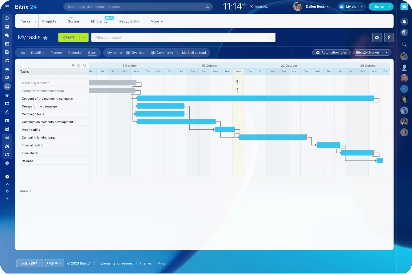
Bitrix24’s task management tools, for instance, make more sense when a user can quickly create a task, assign an owner, set a deadline, and see the work in context.
Mistake 4: Hiding value behind setup
Another failure is hiding core value behind setup work. The product may support the customer’s goal, but the trial front-loads configuration instead of showing a fast proof point.
This is especially risky in software that depends on clean data. If the user has to import records, map fields, configure permissions, and invite colleagues before seeing anything useful, the software appears operationally expensive before the buyer has seen why it’s worth the effort.
Mistake 5: Using internal language
Jargon is a quieter problem. Internal labels make sense to the product team and power users, but new evaluators read them literally.
If the first screens are full of loaded terms, users spend their first minutes translating the product instead of testing it.
Mistake 6: Treating every user the same
Companies also treat all trial users as if they share the same intent, urgency, and background knowledge. In reality, an end user, manager, technical evaluator, and executive sponsor don’t need the same first-session path.
Pro Tip: Add one “evaluation shortcut” for each major persona. For a sales leader, that might be a sample pipeline. For a project manager, it might be a ready-made project template. For an operations lead, it might be a prebuilt approval workflow.
Real-world business use cases: What different evaluators need to see
Early confusion varies by software category because each product asks users to understand, configure, or bring different inputs. The useful distinction is the evidence each evaluator needs before they can judge fit.
Where confusion usually appears by category
Analytics tools often create data interpretation uncertainty: users may connect data but not know which dashboard or metric proves value fastest.
Collaboration tools create workspace-setup friction, where value depends on channels, projects, or teammates that don’t exist yet.
Automation tools create dependency bottlenecks, where testing requires integrations, permissions, or process logic before any output is visible.
In CRM software, a new evaluator may want pipeline visibility but land in a system that assumes imported contacts, configured stages, and ownership rules. In security software, users may struggle to understand whether they’re seeing actual protection, simulated posture, or policy configuration.
Developer tools can fail quickly if setup, API keys, environment changes, or command-line comfort block the first payoff.
|
Software category |
Likely early confusion point |
Business impact on trial conversion |
|---|---|---|
|
CRM |
No useful view until contacts and pipeline structure are configured |
Evaluators underestimate reporting and adoption potential |
|
Project management |
Empty workspace with unclear starting structure |
Users delay team rollout and never reach collaborative value |
|
Analytics |
Unclear which metrics or dashboards matter first |
Product seems complex before insight is demonstrated |
|
Security and HR software |
Role-specific or policy-heavy workflows lack context |
Stakeholders struggle to see fit for their process |
|
Developer and automation tools |
Technical setup, integrations, or dependencies appear before outcomes |
Interest drops before capability is proven |
CRM and sales teams
A sales team tracking deals manually will often evaluate CRM software with a specific question: “Can this help us see deal status, ownership, and next actions without another spreadsheet?”
The evaluator needs evidence that the pipeline will make active work easier to understand. A blank database can’t provide that evidence.
A better first path shows a sample pipeline, a clear deal card, and the next sales action. This is where sales pipeline management matters in the first session. The user needs to see how work moves, who owns it, and what happens next.
Project and operations teams
A project manager needs more than a task button. They need to see whether the system can turn an active piece of work into a shared operating structure:
- Task owner
- Deadline
- Priority
- Status
- Comment thread
- Calendar or board view
Without that, the tool feels like another place to type work rather than a better way to run it.
A useful trial should let the evaluator create a small project, assign two or three tasks, and see how ownership and progress appear across views. They can then judge the operating model rather than the empty workspace.
Automation and workflow teams
Automation users need to see cause and effect. They may understand the desired outcome but still be unable to test it because the workflow depends on integrations, permissions, or clean trigger logic.
In Bitrix24, integrations and automation features can support real workflows, but the trial path should show the sequence before requiring a complex setup.
A simple example workflow can reduce uncertainty:
- New lead created
- Responsible person assigned
- Task generated
- Follow-up scheduled
- Manager sees progress in one place
That sequence gives the evaluator a working picture before they’ve configured every detail.
How to diagnose and reduce first-session confusion
Reducing early confusion improves more than user satisfaction. It strengthens activation measurement because users are more likely to attempt the intended path.
It also helps onboarding teams prioritize real blockers and makes self-serve evaluation a cleaner qualification layer.
Why measurement improves
When users understand the trial path, their behavior becomes easier to interpret.
Marketing can set better expectations. Product can measure earlier signals with more confidence. Sales can engage users who already understand the basics.
The handoff quality improves because behavior reflects real evaluation, not avoidable disorientation.
What to measure
Useful evidence usually comes from a mix of sources:
- Session recordings: Show hesitation, loops, and abandonment points.
- Task-based usability tests: Reveal whether users can complete an intended evaluation goal.
- Onboarding funnel data: Highlights where progress drops between signup and first value event.
- Search queries: Expose what users are trying to understand in real time.
- Support interactions: Show where confusion becomes explicit enough to ask for help.
- Sales notes: Reveal whether reps are answering product-fit questions or basic orientation questions.
Userpilot’s 2025 SaaS Product Metrics Benchmark Report separates activation rate, time to value, core feature adoption, onboarding completion, retention, and NPS. That distinction matters: a user can log in several times and still fail to reach the first meaningful result.
Where trial optimization has limits
Some products are genuinely complex. Some need real customer data before value can be shown. Others involve compliance, infrastructure, or multi-role workflows that can’t be simplified into a five-minute demo-style experience.
A low-converting trial isn’t automatically a usability failure.
For complex products, the goal is to make the evaluation path honest, not artificially easy:
- If the product requires admin setup, say so early.
- If value depends on imported data, show sample data first.
- If a workflow needs teammates, explain which role is needed and why.
- If an integration is required, show the output before forcing setup.
- If the product serves multiple teams, route users by job-to-be-done.
The point is to separate necessary complexity from avoidable ambiguity. Companies that confuse the two either oversimplify the wrong areas or accept preventable drop-off as normal.
For a platform like Bitrix24, this means guiding users toward the workflow they came to test, whether that’s CRM, projects, collaboration, automation, or customer communication. The product can do many things, but the first 30 minutes should still give the evaluator a clear route to one useful result.
FAQs
What if users are confused because the product is powerful, rather than because onboarding is weak?
Power and confusion are separate issues. Complex products can still make the first value path clear by showing where to start, what to ignore for now, and what a credible early result looks like.
A powerful CRM, for example, can still open with a sample pipeline. A powerful project tool can still open with one ready-made task flow. The goal is to give complexity context before the user has to manage it.
How can teams tell whether confusion comes from the interface, the pricing model, or missing customer context during a trial?
Look at when confusion appears and what question the user is trying to answer.
Navigation struggles suggest interface issues. Hesitation around gated features suggests pricing friction. Inability to judge fit without company-specific inputs suggests missing trial context.
Support tickets, session recordings, and sales call notes should be reviewed together. If all three show the same question, the issue is probably structural, not a one-off user problem.
Should companies optimize for speed to value for every user persona, or accept that some evaluators need a different first-session path?
Each high-value evaluator segment should be able to reach a meaningful result without unnecessary confusion.
That may require multiple first-session routes:
-
A sales manager may need pipeline visibility.
-
A team lead may need task assignment.
-
An operations manager may need an approval workflow.
-
An executive sponsor may need reporting and governance signals.
Trying to serve all of them with one generic checklist usually makes the first session weaker for everyone.
Turn first trial minutes into real progress
Bitrix24 unites CRM, projects, automation, and collaboration so new users can reach value faster in one clear workspace.
Get Started NowConfusion doesn’t stay inside the trial
When a serious buyer gets lost in the opening session, the damage spreads. Product data becomes harder to trust. Sales spends more time repairing the evaluation. The buyer starts pricing in training, rollout resistance, and extra management overhead before they’ve seen the product at its best.
That’s the real cost of a weak first 30 minutes. The product may be a strong fit, but the trial has already taught the customer to expect friction.
Bitrix24 gives teams CRM, projects, collaboration, automation, and customer communication in one workspace.
Sign up for Bitrix24 for free and see how quickly your team can move from a new account to a working deal, task, or automated follow-up.